How Do We Ensure Our UX/UI Design Can Scale with Increased Functionality?
Create a UX/UI that grows with your product without losing its charm or efficiency.


Let’s get real for a second. Designing a sleek UX/UI is tough enough when your app has a narrow focus and limited features. But what happens when your product grows? When you add new features, serve different user groups, and scale up to meet business goals? Suddenly, that tight, intuitive experience starts to feel clunky. New buttons pop up like weeds, and before you know it, your interface feels more like a maze than a map.
I’ve seen this happen too often. As the founder of an outsourced software development company, 1985, I’ve worked with plenty of businesses struggling to make their UX/UI designs grow alongside their product. The stakes are high. Get it wrong, and you frustrate users, slow adoption, and hurt your bottom line. Get it right, and you set yourself up for sustainable success.
So, how do you get it right? Let’s break it down.
Start with a Scalable Foundation
Design for Flexibility
Design systems are your best friend. A robust design system ensures consistency while leaving room for expansion. Think of it as the blueprint for your interface—components, typography, color schemes, and interaction patterns all in one place. If a button works well now, make sure it’ll still work when you add 10 more features.

Google’s Material Design is a classic example. It’s modular and adaptable, providing a solid framework for apps with wildly different needs. The same principle applies whether you’re using off-the-shelf design systems or building your own. Invest early in flexible components that can grow with you.
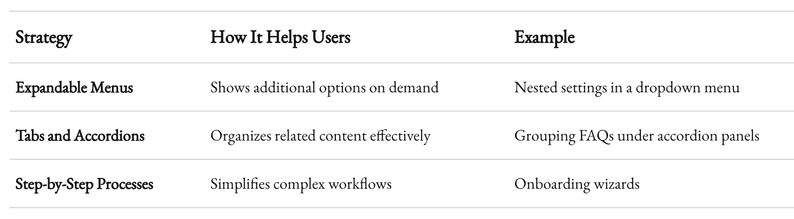
Prioritize Information Architecture
When you’re adding new features, you need a navigation structure that scales. A shallow, static hierarchy might work for 5 features, but what happens when you’ve got 50? Planning for scalability means:
- Grouping related functions: Users think in terms of tasks, not features. Organize your navigation around what they want to do.
- Using progressive disclosure: Don’t overwhelm users with every option upfront. Show them what they need, when they need it.
- Testing early and often: Even the most logical structure can break down when users interact with it. Usability testing helps you catch issues before they become entrenched.
A scalable information architecture ensures your app grows without turning into a labyrinth.

Keep Your Tech Stack in Mind
Your design choices aren’t just aesthetic. They’re deeply tied to your tech stack. If your backend can’t handle the complexity of new features, your UX will suffer. For example:
- Are you using a front-end framework like React or Vue? Make sure your components can be reused and adapted easily.
- How does your API handle data requests? Slow load times or inconsistent responses will frustrate users, no matter how beautiful your interface is.
In short, your UX/UI doesn’t exist in a vacuum. Design and development need to work together.

Grow Thoughtfully, Not Recklessly
Add Features with Purpose
Just because you can add a feature doesn’t mean you should. Before implementing anything new, ask yourself:
- Does this align with user needs?
- Does it fit with our business goals?
- Can we integrate it without overwhelming the user?
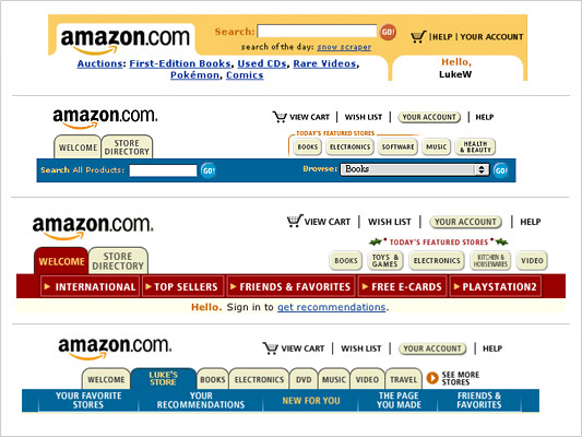
Consider Amazon’s approach. Its interface has evolved over decades, yet it remains navigable because new features are added strategically, with clear value to users. They don’t throw in every bell and whistle—only the ones that matter.
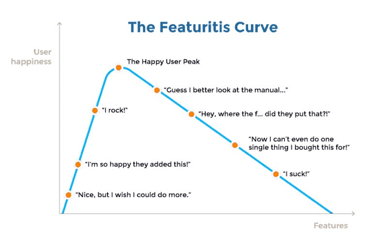
Avoid "Feature Creep"
Feature creep is the silent killer of good design. It starts small: one extra button here, a new tab there. But it adds up quickly. Suddenly, your clean design feels bloated. To combat this:
- Establish guardrails: Create clear criteria for adding features.
- Audit regularly: Periodically review your interface. Are there redundant features? Confusing interactions? Trim the fat.
- Involve users: Feedback isn’t just for new designs. Ask users what’s working and what isn’t, then act on it.
Scaling isn’t just about adding—it’s also about refining.
Stay User-Centric
Understand How Needs Evolve
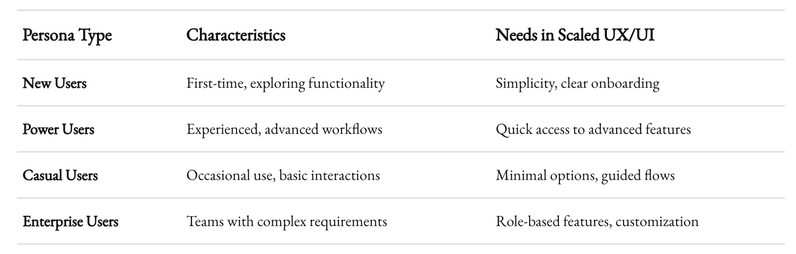
Your users today won’t be the same as your users tomorrow. As you scale, you’ll likely attract:
- New demographics: Different age groups, industries, or geographies.
- Power users: People who want advanced features and deeper functionality.
- Casual users: Those who need simplicity and clarity.
Balancing these needs is tricky but essential. User personas and journey maps can help. Revisit them regularly to ensure they reflect your evolving audience.
Iterate Constantly
Great design is never done. As your product grows, so should your UX/UI. Adopt an iterative mindset:
- Prototype new ideas: Before committing, test concepts with users.
- Analyze data: Usage metrics and heatmaps reveal how users interact with your design.
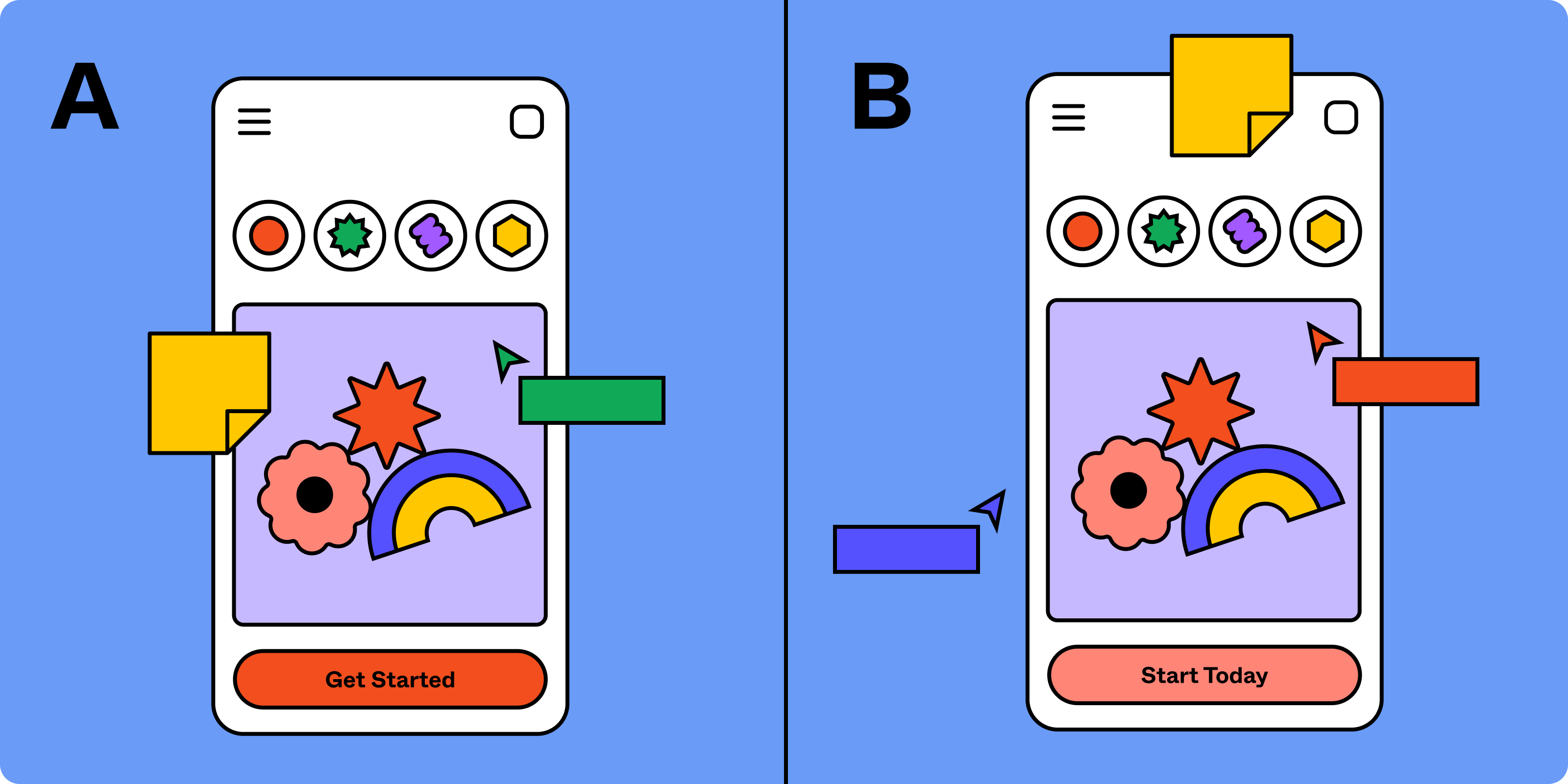
- Experiment: A/B testing isn’t just for marketing. Use it to optimize layouts, flows, and interactions.
Spotify’s design evolution is a masterclass in iteration. From its desktop origins to today’s mobile-first experience, Spotify has scaled by listening to users and adapting its interface.

Accessibility Is Non-Negotiable
As you add complexity, accessibility can’t be an afterthought. Scalable design means ensuring:
- Keyboard navigation works seamlessly.
- Color contrast meets WCAG standards.
- Dynamic content is readable by screen readers.
When accessibility is baked in from the start, it scales with your product.
Tools and Processes to Support Scalable Design
Use Scalable Design Tools
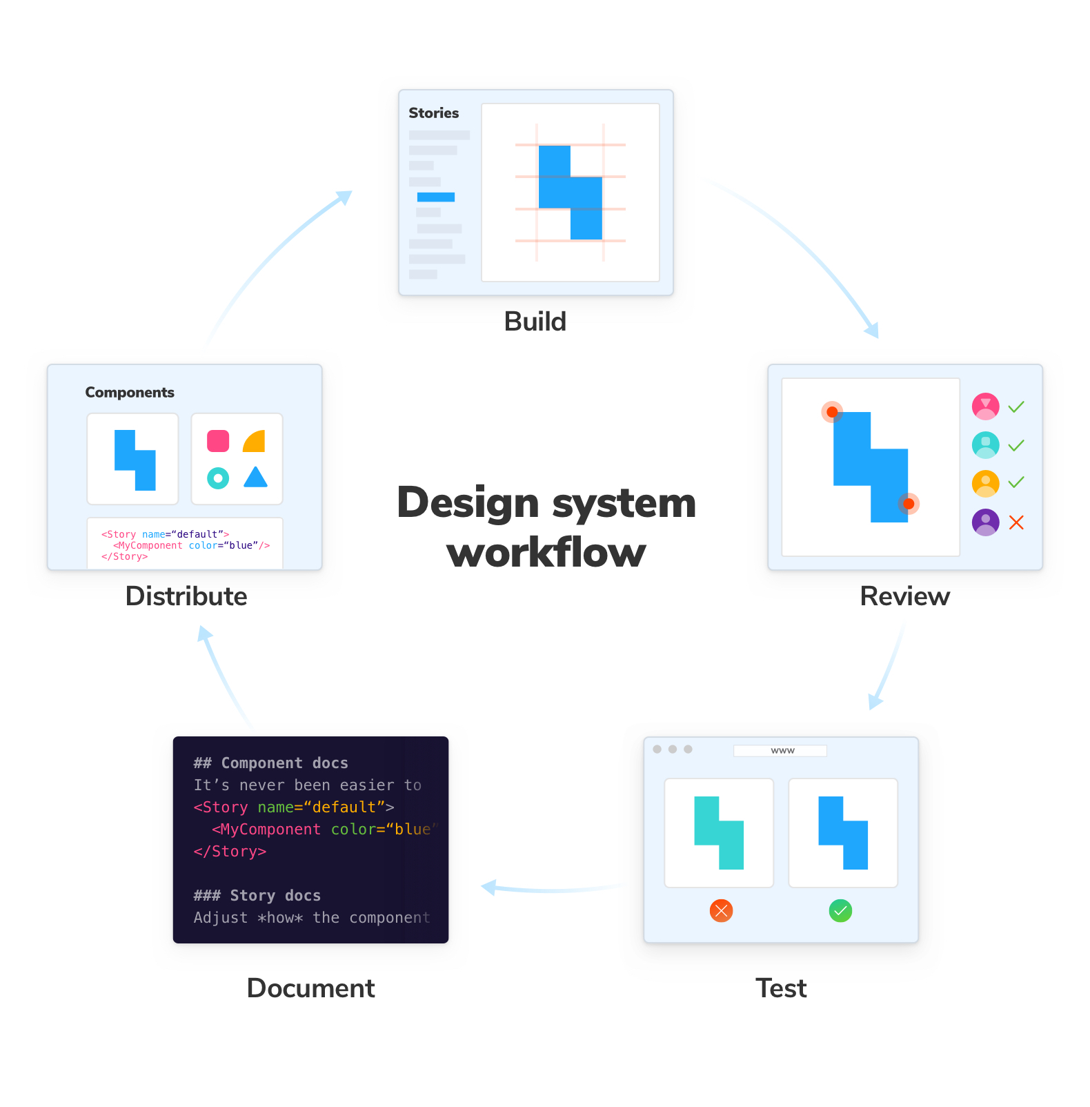
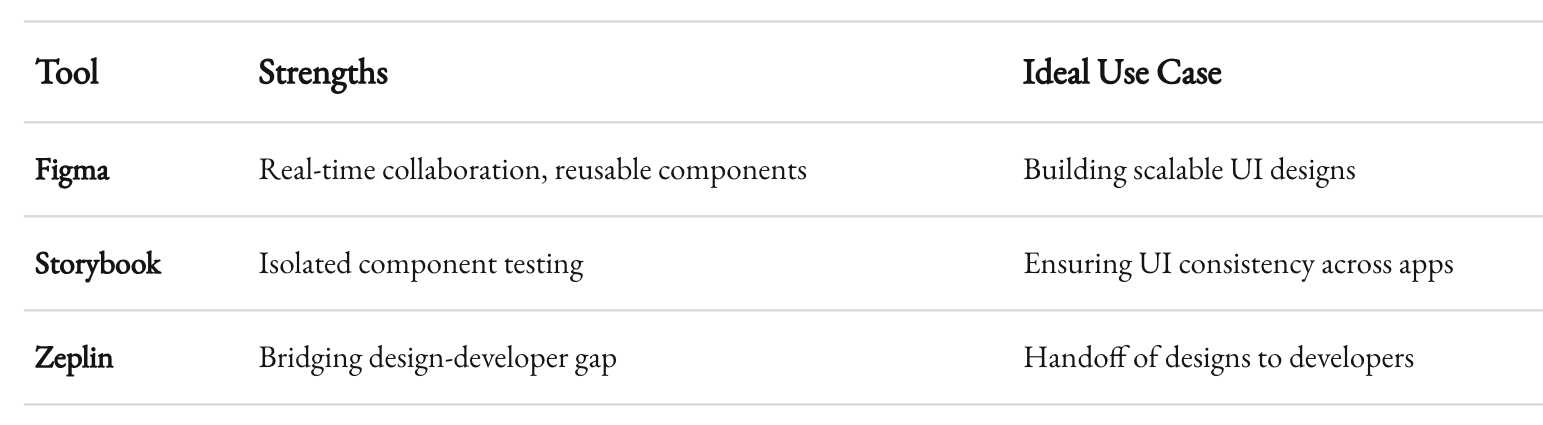
Modern tools make it easier to create and maintain scalable designs. Some favorites include:
- Figma: For its collaborative capabilities and reusable components.
- Storybook: A development environment for UI components, ensuring consistency across screens.
- Zeplin: To bridge the gap between designers and developers.
Build a Culture of Collaboration
Scalable design isn’t just a process. It’s a mindset. Encourage collaboration between teams:
- Designers and developers: Work together to ensure feasibility and maintainability.
- Product managers: Align design decisions with business objectives.
- Customer support: Use their insights to identify pain points and prioritize fixes.
When everyone’s on the same page, scaling becomes a shared responsibility.
![How to Scale UX Design for SaaS [Step-by-Step Guide] | Aspirity](https://static.tildacdn.com/tild3865-3162-4236-a266-383661616538/CustomerJourneyMap-w.png)
Wrapping Up
Scaling UX/UI design with increased functionality is a challenge, but it’s not an impossible one. It’s about building a strong foundation, growing thoughtfully, staying user-centric, and leveraging the right tools and processes. When done well, scalable design doesn’t just support your product’s growth—it drives it.
At 1985, we’ve helped businesses navigate these challenges time and again. If there’s one thing I’ve learned, it’s this: design isn’t just about making things look good. It’s about making things work, now and in the future.


